I can never seem to get on top of my emails, I feel like there is just too many coming in to deal with, many need considered answers or actual work to be done. Currently I am sitting on 281 unread emails which never seems to reduce.
I wondered if there was a way to plot my unread email over time, to feel some sense of accomplishment in dealing with these. I didn't manage to find a way how to do this, but I did find a piece of software called OutlookStatView that extracts statistics from your email inbox.
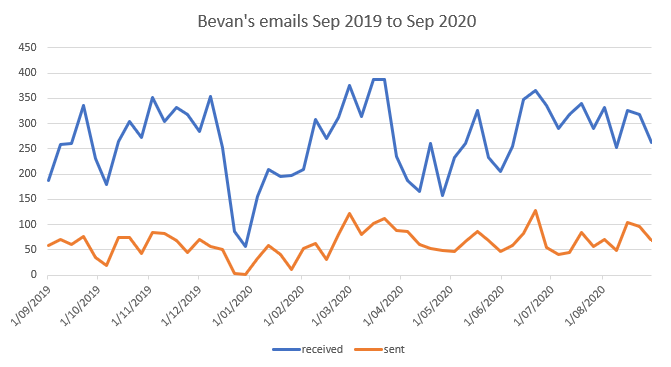
The graph below shows a quick plot in Excel, normally I would use R for graphs in publications, but you just can't beat Excel if you want quick data visualisation.
This chart shows that I receive (blue line) about 250 to 300 emails a week but I'm only sending (orange line) between 50 and 100. It seems I need to take week off work just to answer the email backlog! So if you waiting on me to answer your email, don't feel too bad I'll get to it eventually!


Comments